I am prototyping some experimental web software for the MV_X (future version), trying to see what I can do with Python and Flask. Hopefully I can have something I can share in the near future. My reasoning is as follows:
Python is my preferred language (over JavaScript)
I want an architecture that is modular and lends itself to incremental testing
Besides the basics (login, set-up, data entry, dashboard), I am looking at what can be done to allow students to create their own chart layouts, and experiment with MongoDB queries (MongoDB is the back-end database holding the data).
Currently I have charts build from legacy data (my own, plus 2019 and 2020 GBE data) that have results for individual trials (particular box for a particular activity), as well as summary charts for all boxes for an experiment (semester?). In the future I plan to define a new data format and merge all the data into one common database, with common queries. The charts will look about the same, just some minor tweaks to the queries.
Once I can get an issue or two figured out with Nginx (front end proxy server for Flask, it handles the security) I will open up what I have so far. It cannot take too much of a load, as it is all running on a couple of Raspberry Pi’s.
Update: openagbloom.ddns.net
The website (running on a Raspberry Pi) is now exposed through Nginx (has https security) and at a resting point. There is more work, but enough there to give some direction and raise meaningful questions.
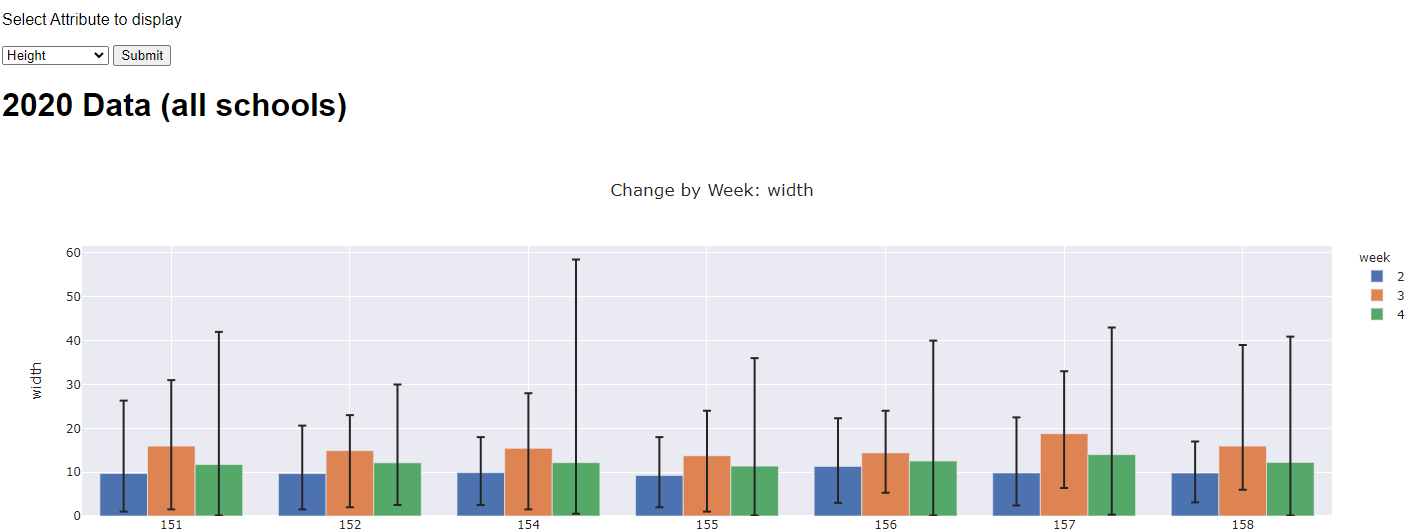
A number of the menu items are stubbed off (not working) or have limited capability. The “Trial” charts are live data from my experimental box, and the “Experiment” charts are from the 2019, 2020 GBE results.
In the long run, other features will be added: charting of water usage (amount pumped), charting of light time/duration.
Questions:
Are these meaningful charts? Too many options, too few?
If the image gallery was for a trial, would this be useful? Would you need the GIF file as well?
How do you find data? Do you know the trials, or do you need to navigate : school, experiment, trial; school, box, trial?
What would you like see added?
What is confusing or not helpful?
Remember, this is a personal experiment and work in progress. What you see here may or may not be reflected by MARSFarm in the future, but your feedback is important and desired.
Wow, it’s pretty impressive to see all of the different components that you’ve built all put together. I do however want to make a few things clear for anyone else reading this thread…
The user @webbhm is my dad. I grew up doing things like volunteering as a citizen scientist and designing/executing projects to build things. When @drew and I set out to create an open-source growth chamber in 2017, @webbhm offered to help us by developing the software for a Raspberry Pi. Now that MARSfarm has these community forums, I’m very excited to once again make our collaborations together public again so that other people may also see the unofficial R&D he does.
I loaned @webbhm one MARSfarm Version 1 prototype in the Fall of 2022, which is what he is using to generate the data now accessible on his website. This is not the software platform being used in production for purchased MARSfarm Version 1’s this is for long-term R&D purposes only.
The data shown on the “Experiment Charts” tab is from Growing Beyond Earth® (GBE), a citizen science program created by Fairchild Tropical Botanic Garden with grant funding from NASA. That information was shared with @webbhm with the sole purpose of developing this prototype for feedback from real teachers so as to improve the value of any charts created in the future for use by GBE participants.
Have you done anything to reference images from S3? Here’s a link to download one, which you can use to test. There are over a hundred in descending order from that, which you could use to test whether that would work instead of a static (ex: 02-08_1500, 02-08_1400, 02-08_1300, etc.) path. These are public so no access should be needed.
The problem I’m trying to solve right now is that the images in the MM.V0.23 Flask front-end sort to show the 28 OLDEST images, rather than the 28 NEWEST images. Any suggestions on how I could modify this code to fix that?
import boto3
from key import s3_access
import string
#get 28 images, theoretically one from each day
def get_28_days(bucket):
    s3 = s3_access()
    count = 0
    result = []
    get_last = lambda obj: obj['Key']

    objs = s3.list_objects_v2(Bucket=bucket)['Contents']
    for obj in sorted(objs, key=get_last, reverse = True):
        if count % 24 == 0:
            result.append(obj['Key'])
        count+=1
        if len(result) == 28:
            break
    #if there are less than so many days, fill with none
    while len(result) < 28:
        result.append("None")
    return result
P.S. Cool sidenote/learning about these forums, the link to S3 automatically converted into an image when I didn’t embed it as a code snippet. Like so,
GBE Plus is an enhancement to the GBE Pico Controller. There are two versions, the GBE_Plus Pico by itself, and the GBE-Plus Pico with a Raspberry Pi: GitHub - webbhm/GBE_Plus
I like the chart options. I think the experiment charts allow for more comparison, and it is cool seeing more aspects of the physical plant. I like the “deaths per week” and the “invalid data score card”. I think it helps students know more about the plants that they are growing.
I like the gallery feature. I think it is helpful and smart to see all of the plant’s photos in one place like that. I love the GIF feature. I have been needing to make some GIFs for my experiments, and it would save a lot of time. I also think it is cool to see, and I feel people (including myself) would use it very often.
I know my box name, and that is how I find my data, I think it would be helpful to group trials by its overall experiment in the drop-down menu. Then from the experiment selected, you can look at data from either the whole experiment or just one trial. I think that would be easier for students to find and compare data. This is seen a little bit in the search feature, and I like that.
Lastly, is there any way you can send some photos of your pepper plant? I would like to see them and use them for some marketing materials.